
One of the most difficult things about making process improvements is knowing where to start. Doing the wrong thing is a waste of time and money, and it makes everyone less willing to participate in the next attempt.
So this blog is a short story about how one company transformed their on-time success rate and some of the key steps they took along the way.
The company won’t allow their suppliers to identify them, so we’ll refer to them as Acme (Acme Corporation - Wikipedia) in this post. They manufacture highly sophisticated remote sensing devices that involve mechanical, electrical, firmware, software, telemetry, and environmental ruggedization. Their products prevent catastrophic failure of critical utilities infrastructure around the world, so it’s safe to say that they have a challenging and rigorous design process.
Like most companies, they struggled to get their projects done on time. Their planned project durations ranged from four to eighteen months, and their average completion times were generally 100% over their goal. In other words, it was taking them twice as long to complete a project as they would have liked.
A few years ago senior management decided that something had to change so they asked their Senior Technical Program Manager and Engineering Director to look for ways to make improvements. Fortunately, the program manager had a lot of experience with Lean manufacturing where “visibility” is a cornerstone, so they devised a strategy with three simple steps.
- Create visibility
- Deliver on time
- Increase velocity
However, achieving visibility in R&D is a significant challenge because most of the work is invisible.
So they did some searching and found Playbook, where our #1 customer goal is “predictable end dates”. (Our tagline is "Visible. Actionable. Predictable." for a reason...) We led them through our three-week Free Trial process so they could be sure the methods would work in their environment, and they immediately implemented Playbook for their entire R&D team.
Coincidentally, nine months later we needed a reference for a business program application, so I reached out and asked both of them for a summary. Here are their exact email replies…
*********************************************************************
Engineering Director
“Prior to the introduction of Playbook into our business, we had no real visibility of the reality of what was happening on a project and as a result, felt like passengers rather than in control.
Planning (when it happened), was centrally managed by an individual, often a level removed from both the detail and the facts. Management oversight was via monthly reviews, of which plausible excuses and disappointment (sometimes anger) were the dominant themes. We were drifting.
Two things happened to improve the situation.
- We came across Playbook via Google (I believe it was a search on “lean”, “program management” and “tools”). The search was driven by a need to change our approach.
- We had an individual join us from a manufacturing environment, who had been practising lean management successfully for a number of years. He was also a strong change agent, with a different perspective to our problems.
The messaging and online material for Playbook resonated from the start – was it possible our failings where not unique?
The initial engagement with the “concierge” approach to training, accelerated our progression up the change curve; the zero costs of first trial deployment meant we had little to lose. A good model for securing initial engagement…
Fast forward 9 months. Our daily routine has changed. Programs are managed by the individuals doing the work, on a daily basis – they own it. The Engineering Leadership team meet daily for 30mins to review the state of the programs, based on the teams daily progress; where necessary the Leadership facilitate the teams with whatever support is needed to remove roadblocks and recover any slippage. This change has been driven by the insight that Playbook has brought to the realities of the project execution. The buffer chart (for me) is the thing of biggest value. It allows a day to day view on progress and as we get more experienced we can start to translate second order features (buffer chart gradient) into leading indicators on program health.
I think introduction of change and adoption of Playbook is a continuum rather than a discrete step - we still have a long way to go – next steps are to add more of our activities into Playbook so we can start managing cross multiple projects and activities. We are also just starting to look at the project history replay feature, to allow us to root cause slippage and get improvement actions in place for subsequent programs.”
Senior Technical Program Manager
“The impact that Playbook has had on our Technology team has been significant, giving us some structure to our operating rhythm and helping us see waste so we can work to eliminate it.
What this means is:
- Better visibility of priorities to individual engineers
- Better visibility of overall progress of projects to management
- Ability to respond earlier to issues and problems
- Encouraging daily planning with the individual engineers, something that wasn’t happening in the past
- Forcing more forward looking planning, rather than seat of the pants activities and lots of surprises
- Encouraging better dialogue within teams about what to do and when to do it
- Also, good record of the activities and milestones in projects
This has led to:
- Better planning at all levels of the teams, fewer surprises
- Improved velocity delivering NPI programs, we haven’t stopped being late, but we are faster and more efficient
- More effective resource allocation across programs and projects
- Better ability to cope with Covid impact as Playbook helps coordinate working from home activities
- A framework to drive overall business improvement, where Playbook can feed into our policy deployment plans (helping us with the check and act part of PDCA)”
*********************************************************************

Visibility - A Key Component of Lean
The goal of this first phase was to create visibility. Playbook does that in many ways with the reports and KPIs, but the ultimate report for predictable end dates is the buffer chart.
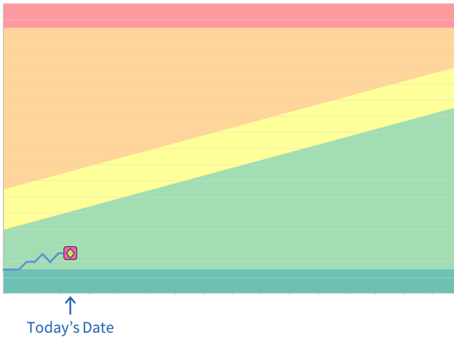
If you’ve never seen these before, they are a simple chart that shows where the milestone is relative to your planned end date. Because of the way Playbook works, it is up to date 24/7 so there is no need to wait for a status meeting in order to find out how things are going.
You literally just look at the chart.
The horizontal axis is the planned duration of the project to the major milestone that you are tracking. All of the task durations are estimated without individual buffers added to them, so a shared team buffer is added at the end of the major milestone. This is to account for normal cause variation and the size of the buffer is based on the number of tasks and the amount of risk in their estimates.
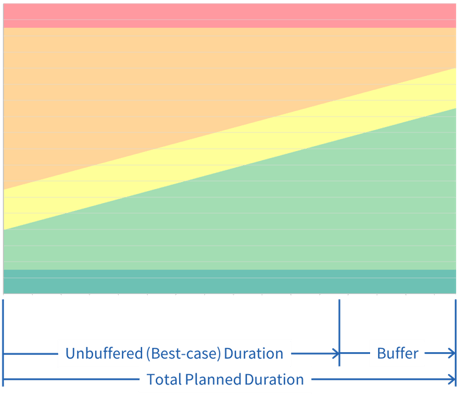
So the published end date includes the shared team buffer.
The vertical axis represents just the duration of the buffer and is rescaled to make the chart taller and more visible…
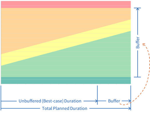
And the top right corner just below the red zone is the target end date.
Every day during the project, the milestone is plotted on the vertical axis to show how many days of the buffer had been used on that date and the trailing blue line shows how it got there. Any time the milestone moves in either direction (left or right in the plan) you can record the reason why. So at the end of the project you will know what caused every single delay and how much, and also everything that was done to save time as well.
Project Schedule Risk
The colored zone that the milestone is in represents the level of risk in hitting the target end date for that milestone.
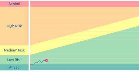
Now that you understand how the buffer chart works, you can see why the Engineering Director said, “The buffer chart (for me) is the thing of biggest value.” It provides immediate and accurate feedback on the status of the milestones, as well as the probability of hitting the future end date.
Their Examples
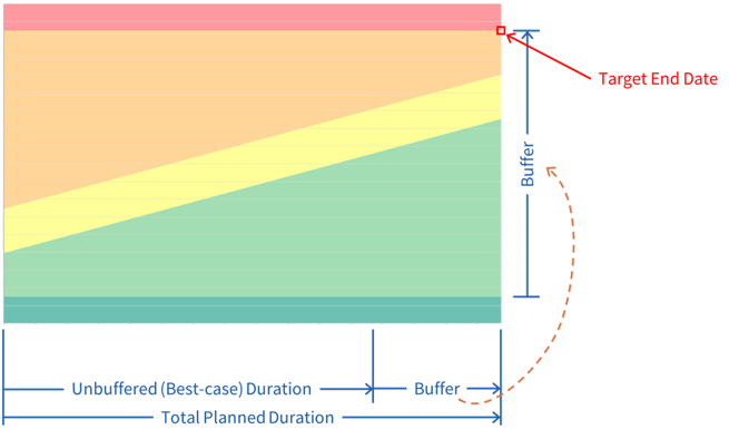
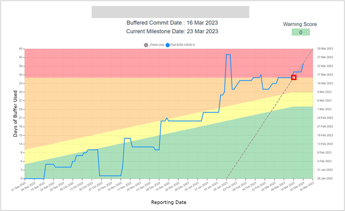
So let’s take a look at the buffer chart of an early project they executed with Playbook. Since they missed their end date by a significant amount, the target window of performance is quite small so I have added the dot for their original target end date.
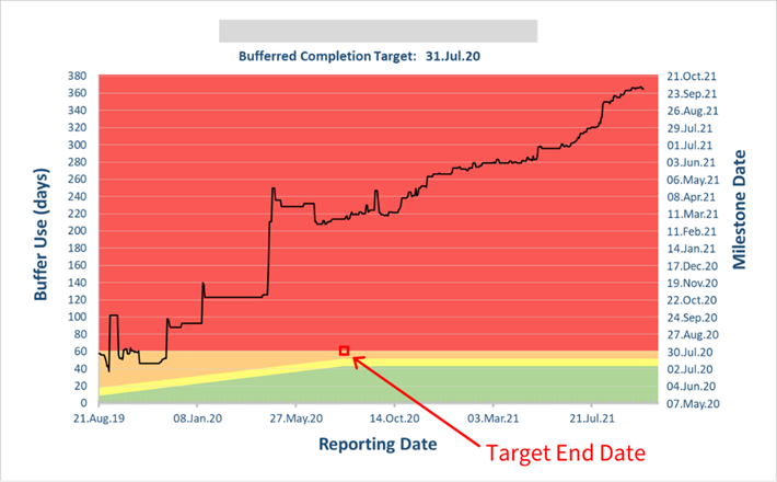
You can see that this was originally planned as a twelve-month project that included a 60-day buffer but ended up taking fourteen months longer than they had planned.
While that may sound like a failure, they were quite pleased for several reasons. Even though it was late, they knew about every delay right when it occurred so there were no unexpected surprises at the end. For example, ten months before the due date, they could tell that they weren’t going to finish on time. And though that’s disappointing to find out at any point, it was much better than a previous project when they discovered that they were many months late right before the scheduled release date.
And just as important, they had real data that showed what was causing every delay...
Root Cause or Critical Constraint
It turns out the critical constraint in their system was firmware development and testing. They were aware this was causing delays, but they hadn’t seen the true impact. And those resources were on two projects that had a higher priority. So any delay on those projects meant this project also got delayed by that amount before the resources were even available to work on this one.
You can see where the firmware resources were finally dedicated to this project as a first priority. All of the subsequent delays were the much smaller daily slips.
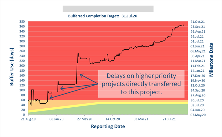
Now that they had visibility, they were also able to collect real data and prove the impact of the constrained resources. So when they requested additional resources for this group it was approved this time.
Problem Solved
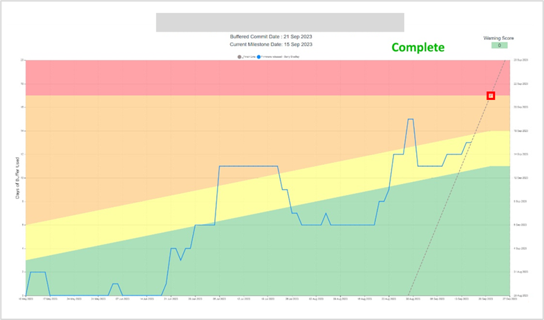
And now that they had established visibility and fixed the root cause as part of their first goal, their next goal was to complete a project on time. And this is the buffer chart of their next project…
I have added the red box to show the target end date, and you can see that they barely missed it by five business days…!
What I found very interesting was even though they used to be months late, they said in an email that they were “a bit disappointed” they missed this end date by five days.
It’s amazing how much your goals can change once you see what is possible... 🙂
But it didn’t take long for their ultimate success as their very next project was completed four days early…!
Portfolio Milestone Chart
And now that they have moved all of their projects into Playbook, they are able to show the status of every milestone on one chart called the Portfolio Milestone Chart.
This has the same background as the single buffer chart that shows the schedule risk, but the horizontal and vertical axes are normalized to percentages since the project schedules and buffer sizes vary.
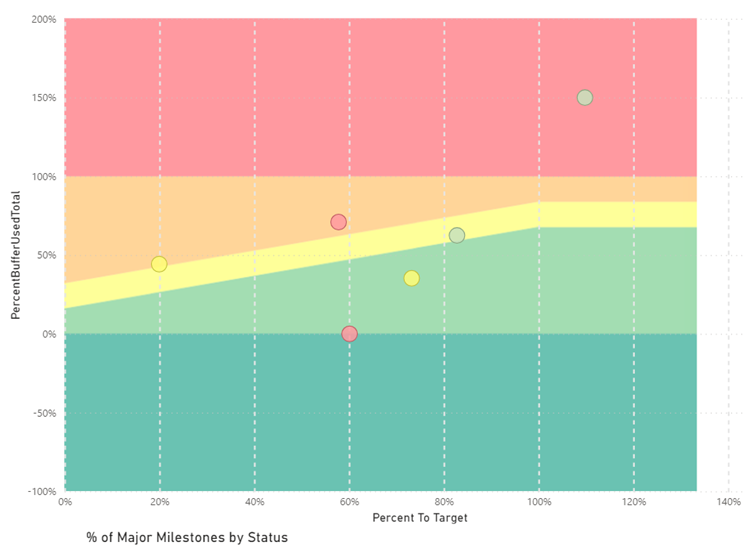
Each dot represents a milestone, and the color of the dot represents the “warning score” or how out of date some of the details are in the plan for that milestone. So a red dot means there are a lot of things that are out of date and may cause the end date to move when they are updated.
So at a glance you know two things about every project in your company.
- What is the status (how likely are we to be on time)
- And how much can I trust that data
From "Available" to "High Visibility"
This company liked the portfolio milestone chart so much that they decided to put it on a large screen in a high traffic area and include the individual buffer charts as well.
When I asked about the impact, the program manager said it has created another level of awareness, communication, and focus on these goals.
It’s one thing to know a report exists somewhere and you can click a link to open it, but it’s quite another to have it displayed where everyone sees it several times a day...!
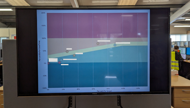
Another added benefit he shared was that senior management used to not respond to project help requests until after the project was late, but now they respond when the milestone is in the orange band or higher!
This is what happens when management believes the feedback they are getting and are confident their actions will make a difference.
Key Points
There are a lot of lessons in this success story, but here are a few key takeaways…
- Senior management set a high-level goal to improve project delivery and assigned someone high up in Engineering and Program Management to focus on it.
- The Engineering Director teamed up with someone who had a background in Lean Manufacturing and knew that some of those principles would apply to NPI projects.
- They started with a goal of just creating visibility, and because they used Playbook, they were also able to acquire unprecedented amounts of project data.
- They performed a root cause and fixed the problem.
If you would like to experience a similar change in your organization, reach out to schedule a discovery call where we will discuss your unique situation and goals.
Related Articles
Project Reporting
Shared Project Buffers
Best Books on Lean, Agile and Theory of Constraints
