
Are you on track to hit your next project milestone?
Most project teams hold status meetings once every two weeks. But have you ever considered that if your product development process follows the bimonthly status meeting model, it’s possible that you won’t know about a critical delay until two weeks after it occurred? By that time, you have lost precious time to respond, and it might be too late to mitigate the delay.
For example, at the bimonthly status meeting the team learns that parts are delayed. If the team was aware of the delay one week earlier, they could have expedited the shipment for quicker arrival, or found a faster supplier. But since they found out after the fact, they didn’t have the option to do either because the parts were already been ordered and put on the slow boat to their destination.
The fact of the matter is, a two-week lead-time for communication is just way too long. So how do you get the information you need earlier to the team members that need it?
You set up your project team for success through processes and tools that enable the entire team to learn earlier.
In fact, real-time communication and zero-touch reporting is a must have requirement for your project management software tool.
The Most Effective Project Status Report Template
One of these tools is a zero-touch Shared Buffer Chart that is available in real time, 24/7. First let’s talk about what a shared buffer is, then we will cover buffer charts and the surprising thing shared buffer charts have taught us about project delays.
What is a Shared Buffer?
A shared buffer is an extra amount of time placed at the end of the project or major milestone in lieu of padding (buffering) every task. It is a technique very similar to project buffers from Critical Chain Project Management.
They have many advantages, but one of the primary ones is that the team members are asked to give 50/50 or “on average” durations for their task estimates. This takes all of the padding out of the individual tasks so you can see how long the project would take if everything went really well.
But in the real-world things don’t go well all of the time, so we create a buffer at the end of the milestone to account for the “normal cause variation” that occurs. And the end date of that buffer is the published (or commit) date of the project or milestone. So, the project is completed on-time if all the work leading to the milestone has been completed and the milestone has not moved past the right end of the buffer.
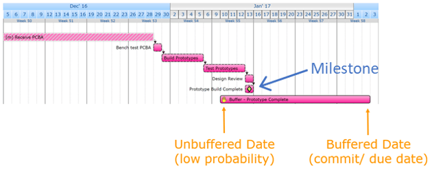
In the image above, you can see that the milestone (task with the green diamond) has moved to the right three days from the beginning of the buffer. So we can easily see how much of the buffer has been used on any given day by looking at the end of the plan. But this view doesn’t tell us how the milestone got there—how many days it moved, and when. In order to see the history of the milestone, we need to track it on a buffer chart.
Buffer Charts
Buffer charts are used to plot the movement of the end date milestone over time, and they have several other benefits. They give an early indication if a project is likely to be on-time or late, they help predict actual completion dates, and are a great way to show the current status of the project at a glance.
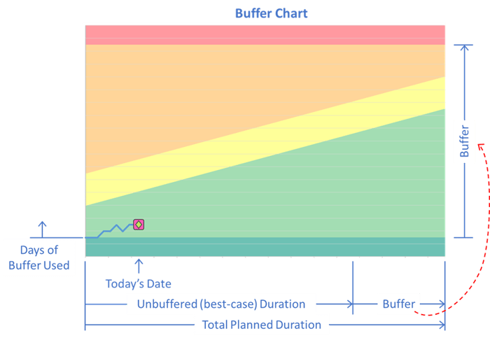
In the image above the project's “Total Planned Duration” is the length of the horizontal axis, which is equal to the duration of the “Unbuffered Tasks” plus the “Buffer” at the end.
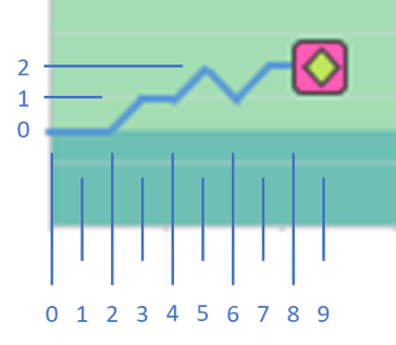
The length of the Buffer is then used to create the vertical axis on the chart as shown by the dashed red arrow. When the milestone moves to the right one day in the plan, that shift is shown as a one-day step in the vertical direction on the chart. You can see the history of the milestone in the chart above by looking at the track that it followed.
In this example, the milestone didn’t move for the first two days. Then it jumped one day on the third day and remained there on the fourth day before it jumped a single day again on the 5th day.
The report not only shows us the amount of each delay and when they happen, it also records and reports the reason for the delay and displays that information when you hover over the data point. (See the image below.)
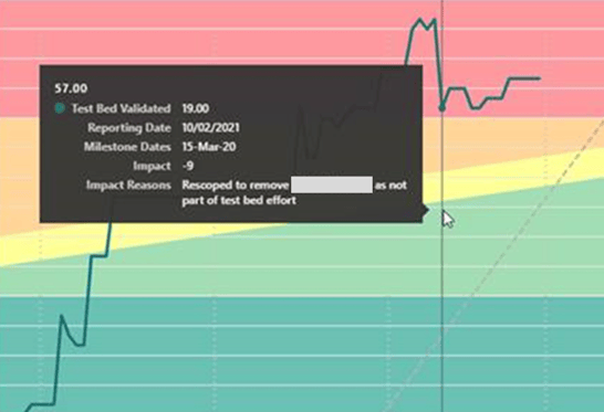
Because Playbook remembers the reason for the delay as well as the size of the delay, you can export this data from all of your projects and look for systemic issues and their relative impacts. This approach is much more effective than trying to commit all of these reasons to memory when you’re looking for ways to improve your process.
Knowing the Heath of Your Project Portfolio
You can see that buffer charts have a lot of benefit in looking back at project history and current status, but in Playbook they have an added benefit that most project management tools don’t—they help to create predictable end dates.
Notice that the buffer chart background has five different color zones. Each one represents a different level of risk or probability of hitting your target end date.
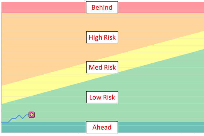
The dark green area at the bottom (Ahead) means that you might finish earlier than your Unbuffered End Date. (That would be great, but it rarely happens, right…?!) The light green area means your project is using the buffer at a safe rate. But if you find yourself in the yellow, it’s time to start looking at the reasons for delay and planning some contingencies.
Then if it moves to the orange zone, it’s time to start executing contingencies to keep it steady or move it to the yellow zone like the team did in the example below.
Keep in mind, the buffer ends at the border of the orange and red, so you finish on time as long as you’re in the orange or below. And remember that later in the project, it’s more difficult to find ways to save time. So it's important to be looking for ways to save time, daily. Every day counts as you'll see below...!
Once you know how to read these buffer charts, they give quick visual feedback on the health of your project and can be put in a dashboard so you can review the health of your entire project portfolio at a glance.
The surprising thing buffer charts have taught us about project delays
The use of buffer charts has taught us that although technical hiccups and procurement delays have an impact on project timelines, typically more than half of the overall project delay is due to daily slips.
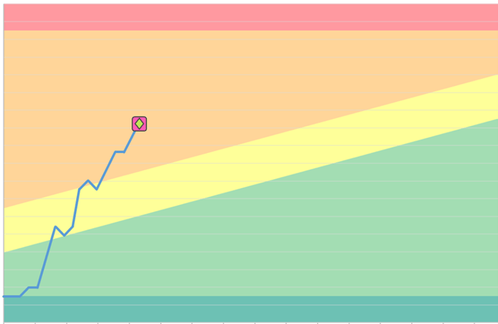
For example, the image below is from an actual project. Notice that there were only three times that it experienced a delay of about ten days. These are probably vendor delays or test failures, and thirty days is a big impact to a project.
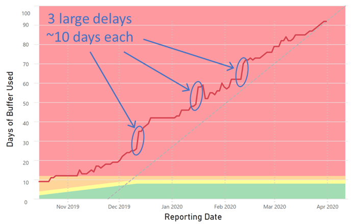
But look at the rest of the milestone track. There were over fifty days of slips that were one or two days in magnitude…!
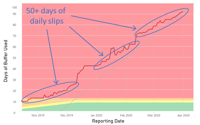
These were almost certainly caused by incorrect priorities—people were working on non-critical work and didn’t know it. And since no one knew it was happening, it continued until it caused more than half of the delays on a project that had a 300% expansion rate.
This is a clear example of Playbook’s primary benefit—ensuring everyone has correct priorities across all their projects.
This benefit alone could cut project times by 30%...!
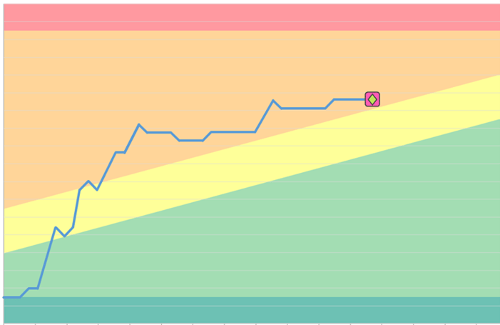
In fact, the buffer chart below is from a project that was using Playbook. You can see from the timeline that it was a 13-month project and literally ended one day after the target end date. Imagine that!
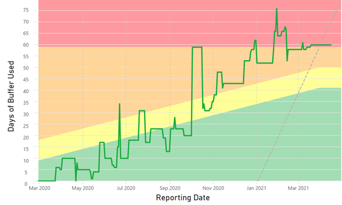
But look closely at the milestone track. You can see that there were only a few daily slips of a single day or two. All of the other impacts were five or more days. But the team also found ways to pull the milestone back on about seventeen different occasions.
And because this team recorded the reason for every delay, they have very valuable information to use when they plan and execute their next project.
That’s the power of real-time visual feedback that everyone has access to—from the team members up to senior management.
What is the status of my project today?
One thing we haven’t mentioned yet is that no one has to update these reports, or even do anything to generate them. They are created with zero-touch reporting and generated as a result of the team using Playbook to manage their tasks. Everyone has access to the reports, and they are up to date in real-time, 24/7.
Now that you know understanding the true status of your projects is possible, go ask your teams these two questions.
- What’s the current end date of our next major milestone?
- What has caused all of the delays so far?
If you would like instant answers to these questions for all of your projects, reach out and request a Free Trail of Playbook. We will train one of your teams on the lean and agile methods for hardware projects, show them how to use the software, help them plan one of your live projects, set up these buffer charts and the rest of our KPI framework, and let them run Playbook so you can see if it works in your environment. Seriously, no cost and no risk.
For more information on Project Reporting and Shared Project Buffers
Share Project Buffers
The Project Management Report You Can't Live Without
Project Management: Do you know the dark matter in your project plan?
