
In previous posts I’ve written about reports that are meaningless, misleading, and even damaging. (Yes, the last one actually causes your projects to take longer.) So now it’s time to share some that are very useful even though you’ve most likely never heard of them.
Before I do that, I want to remind you that the number one goal of our customers is to develop new products on time. So a useful report has to contribute to that goal in a meaningful way.
And since complex projects have so many things that can impact the schedule, this report has to account for all of them, and ideally predict them in advance.
Thankfully, it does all of that and more.
But it has one problem. Its name...
It’s called a “Buffer Chart”.
It’s a time-honored game for team members to add buffer to their plans, and for management to cut the timelines because they know the team added buffer.
This is so common that some companies are not even allowed to say the word ‘buffer’.
So we tried to think of a different name, but the word ‘buffer’ is so descriptive that we couldn’t come up with anything better.
The good news is, once management understands it, they end up liking it—a lot.
Everything starts with a plan
As a reminder, Decentralized Planning is a critical step in developing a useful plan.
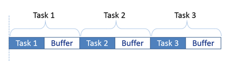
But there’s something that happens when you involve the team members in the planning. They tend to add buffer to their estimates. No one wants to be late, so if someone thinks they could complete a task in five days, they probably wouldn’t tell the PM that. Instead, they would add their own buffer and tell the PM they need ten days.
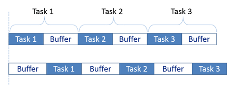
So if three people in a row did this, you would have a thirty day plan that has fifteen days of work in it and your schedule would look like this.
No problem, right?
Wrong.
There’s this thing called “Student Syndrome” that says that people don’t start working on something until right before it’s due…
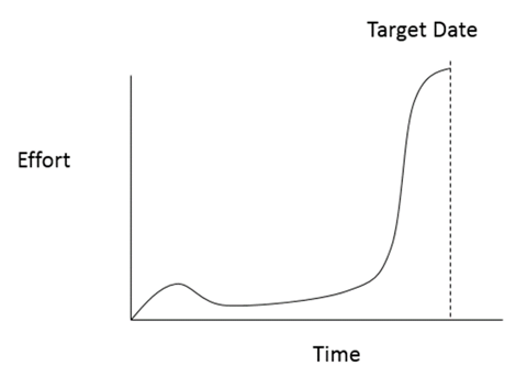
And it’s not because we’re lazy college students (anymore)… 😊
It’s because we have other more important things to do first.
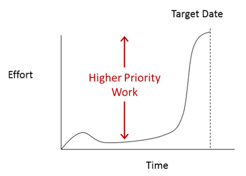
So we work on those tasks first, and then switch to this one when it becomes urgent. And because things usually take longer than we expect, the actual execution of the work looks like the second row.
Notice that we started with a plan that was twice as long as it needed to be, but it actually took longer? Doesn’t that sound familiar?
Critical Chain Project Management teaches the team members to give their “50/50” (or “on average”) estimates for the task durations, and then create a shared buffer at the end. The size of this buffer is based on how much risk or variability is in the tasks and how many tasks there are.
So now the plan looks like the third row…
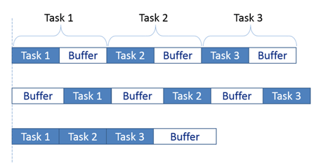
The size of the shared team buffer is smaller than the sum of the individual ones. And because the team members know they will be using the team’s buffer if they are late, it encourages them to focus and get their work done.
However, since they are not allowed to buffer their own estimates, we have to give them time to focus when it’s time for them to work on their tasks. So it’s a two way street, and it greatly reduces the evil and nefarious multitasking.
And most importantly, since the buffer is an existing object in the plan, it can be used to track progress.
We do that by placing the buffer below the major milestone in the plan…
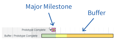
Milestone Buffer Chart
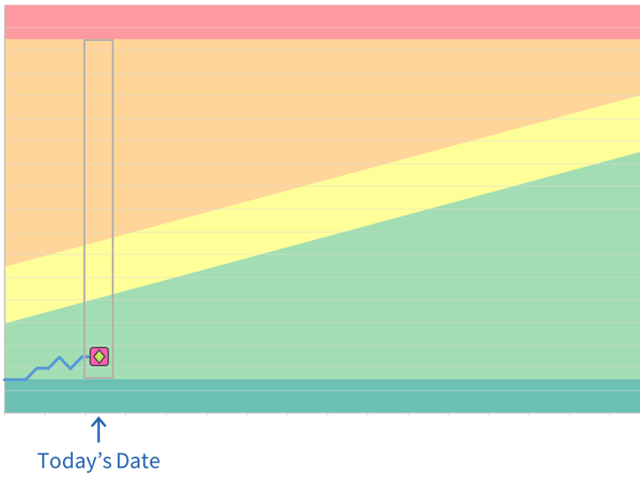
To explain how this works I’ll start with a zoomed out view of a simple plan.
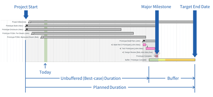
In the image above, the top five summary tasks are all collapsed, and the final summary task is expanded so you can see the major milestone (with the green diamond) at the end.
This image does not include the dates, but the target end date on the right is eleven weeks after the start date, and the buffer is fifteen days long.
The green “Today” bar shows the project started seven days ago, and the major milestone is above the third day of the buffer. So the team has used three days of the buffer.
The location of the milestone is easy to see in the plan, but you can’t see when and how it moved. So for that we have the very useful milestone buffer chart.
To understand how it works, let’s take the dimensions from the bottom of Gantt chart…
And add them to this colored background…
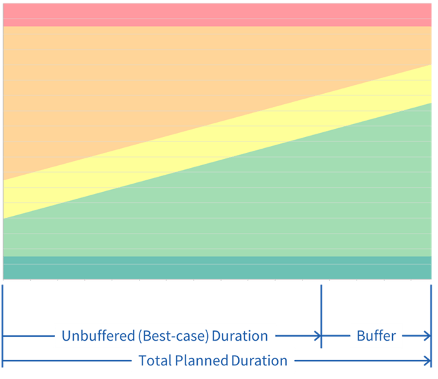
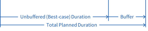
The horizontal axis represents the total planned duration of the project. And the buffer is at the end.
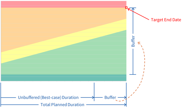
The height of the chart (between the dark green at the bottom and red at the top) represents just the duration of the buffer and is typically stretched to make the chart more readable.
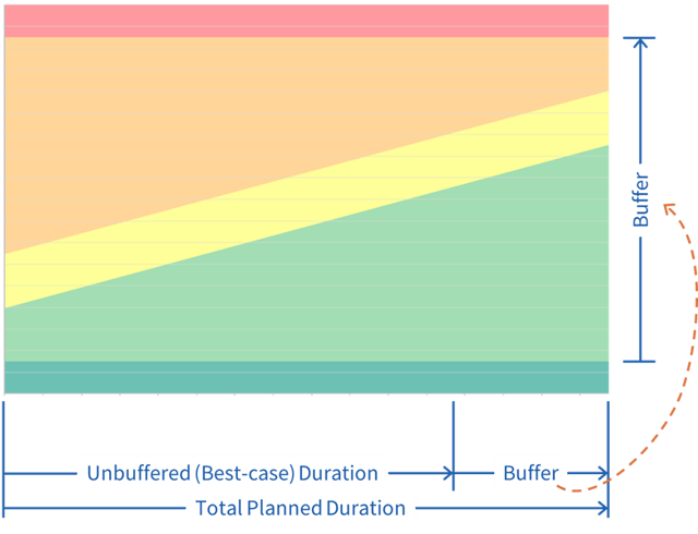
So the “target end date” is in the top right corner.
Every day the milestone is plotted on the chart. And every time the milestone moves to the right in the plan because of a delay, that shift gets captured on the vertical axis in this chart.
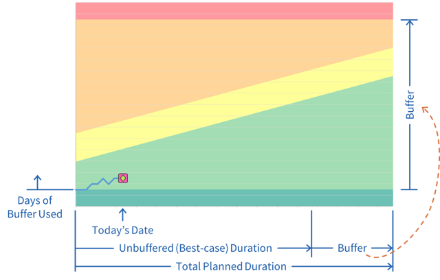
So in the chart above, you can see that on the eighth day of the project the milestone had moved four times (up three times and down one time).
One other way to picture this is to imagine that each day on the chart is essentially the same as taking the buffer that you see in the plan…

…and stacking it vertically in the chart (as represented by the gray outline).
Now that you see how it tracks the milestone, the last thing to point out is what the colored zones mean.
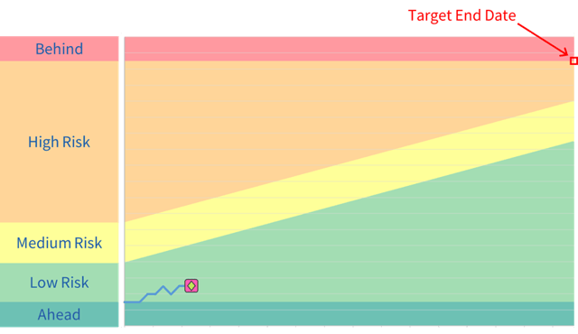
Each colored zone represent the amount of risk you have in hitting your target end date. In other words, if you consume your buffer too fast, you will run out before the target end date. And since you can see the milestone move every single day, you get very early warnings so you have time to do something about it.
Engineers know that high performing systems need fast feedback and this provides that feedback every 24 hours…!
How do you size the buffer?
Critical Chain has a fairly detailed process for sizing the buffer but we have developed a much easier method that has plenty of accuracy.
But it’s important to understand that this buffer is intended to account for “normal cause variation”. It is not intended to account for major delays or other types of risk. Those are dealt with separately with a project risk management process.
Who Keeps The Buffer Chart Up To Date?
One of the key features of this report is how it gets updated. Because the team members update their tasks at the end of each day (this only takes two minutes) the report is always up to date.
(Watch this four-part demo to see how correct priorities eliminate the biggest cause of delay, in return for team members spending 120 seconds keeping their tasks up to date.)
Granted, there are times when people don’t update their tasks, or other things happen that impact the plan, so we display a “warning score” on the buffer charts.
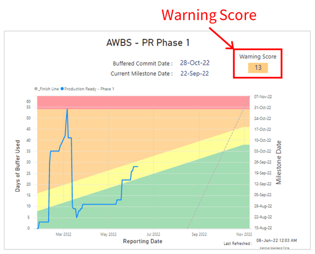
This simply tells you that there are updates that need to be made to the plan (it even lists them) and if you do, they may change what you see on the report. In other words, it tells you how much confidence you should have in the report.
How Does a Report Drive Behavior?
People tend to think that reports can only be used to show ‘what happened’. What they don’t realize is that reports actually drive behavior.
So it’s unfortunate that some of the most common reports are driving behavior that makes projects take longer. (Read the blog post here.)
Tom Peters said a long time ago, “What gets measured, gets done.” That has been tested and proven to be true.
Because Playbook notifies you each time a delay occurs, and the buffer chart tracks every delay in one easy to view place, everyone on the team is focused on them and encouraged to not only look for ways to prevent delays, they are also encouraged to look for ways to make gains as well.
And that’s how you achieve predictable end dates.
Additional Benefits of a Buffer Chart
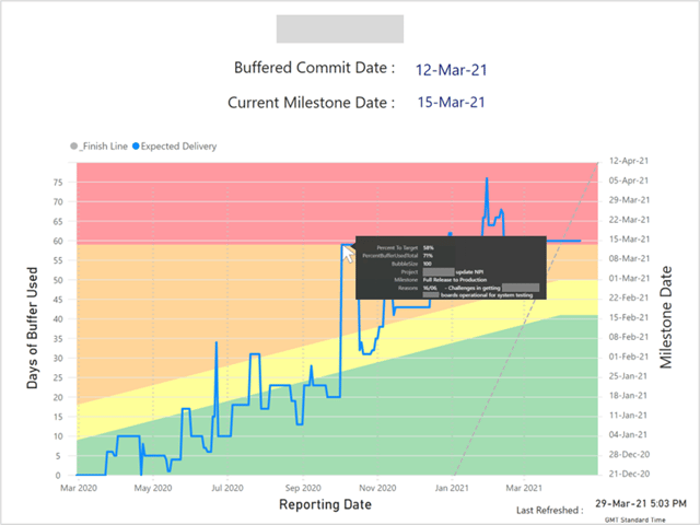
Whenever a team member makes a change to their task in Playbook that impacts the milestone date, they are prompted to capture the reason for the change. Since this chart displays every shift to the milestone, you can see what caused the change when you hover over each data point.
You can also group each delay into categories and show a summary of their impacts.
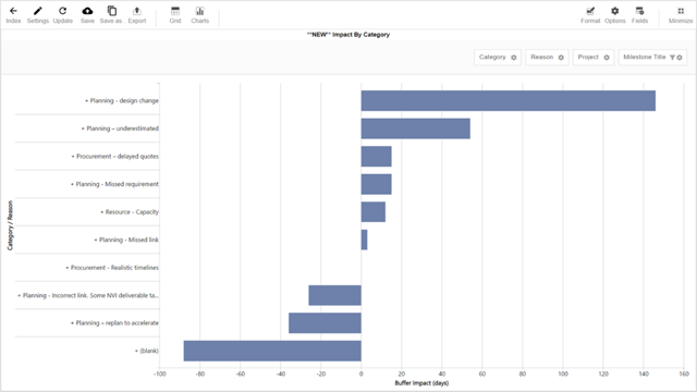
You can also export a report of every change along with the amount of delay (or gain) they caused so you can plan future kaizen events based on actual level of importance.
After all, how can you solve future problems if you can’t quantify what is causing them?
Now that you understand how the individual buffer chart works, it’s a pretty short jump to understand the most valuable report for your enterprise…
Portfolio Milestone Chart
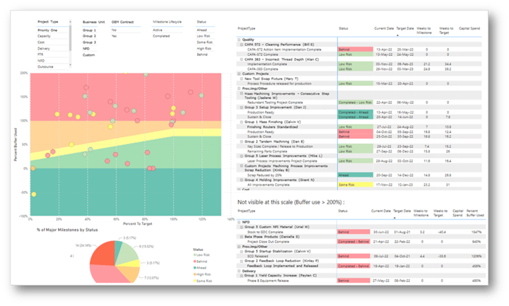
This is called the Portfolio Milestone Chart. Using this report will not only change how you run your status meetings (and eliminate a lot of wasted time) it will enable you to respond to changes and get your critical projects done on time.
Isn’t that the ultimate measure of the value of a report?
But there’s too much to cover here, so I’ll do it in the next post.
If you have any questions or would like to discuss how to change the reporting culture (and on-time delivery) at your company, feel free to schedule a call with me.
Good luck, and I hope you get to try reports that drive behaviors that lead to predictable end dates!
Footnotes: We didn’t invent this concept. It came from Theory of Constraints and their Critical Chain Project Management methodology. But just like all of the other good methods that came from Lean Manufacturing and Agile Software Development, we modified it and tweaked it to work for NPI and other complex projects.
To learn more about how these methods were developed, read this eBook.

